You sit down to start designing your next wrap and just can’t finalize the color palette you want. Or, maybe you know you want a mostly blue wrap design but aren’t sure what colors to mix in with it?
If you’re asking yourself these questions, you aren’t the only one! (phew)
We sat down with our design team and picked their brain on how to select colors that flow nicely with one another.
So, take a minute and review this color guide before you sit down and start playing around with world’s best wrap customizer!
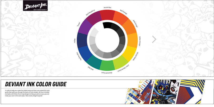
CUSTOM WRAP COLOR GUIDE
In order to help you create the sickest wrap out there, we created this color guide that walks you through the basics of color design. We have included examples with three of our wrap designs to help you picture ways you can make your own in the same style. Take a look and get inspired!
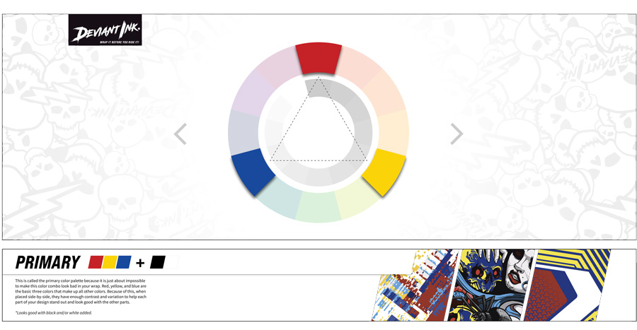
PRIMARY COLORS
This is called the primary color palette because it is just about impossible to make this color combo look bad in your wrap. Red, yellow, and blue are the basic three colors that make up all other colors. Because of this, when placed side-by-side, they have enough contrast and variation to help each part of your design stand out and look good with the other parts.
*Looks good with black and/or white added.
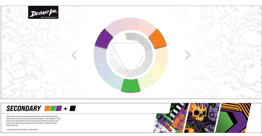
SECONDARY COLORS
These colors are the in-betweens of the primary colors. Because of this, they work in a similar way, but if you are looking for a non-traditional color scheme, this could be the one for you. Because of their locations on the color wheel, they also have great contrast as well as variation to keep people looking!
*Looks good with black and/or white added.
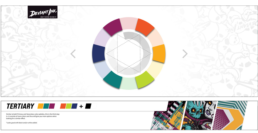
TERTIARY COLORS
Similar to both Primary and Secondary color palettes, this is the third step in. It consists of more colors and thus will give you more options when looking for a similar effect.
*Looks good with black and/or white added.
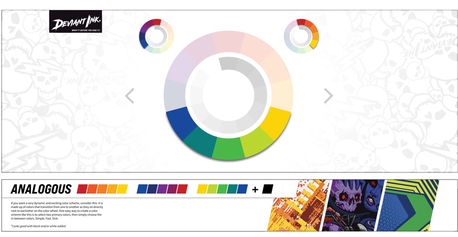
ANALOGOUS COLORS
If you want a very dynamic and exciting color scheme, consider this. It is made up of colors that transition from one to another as they sit directly next to each other on the color wheel. One easy way to create a color scheme like this is to select two primary colors, then simply choose the in-between colors. Simple. Fast. Sick.
*Looks good with black and/or white added.
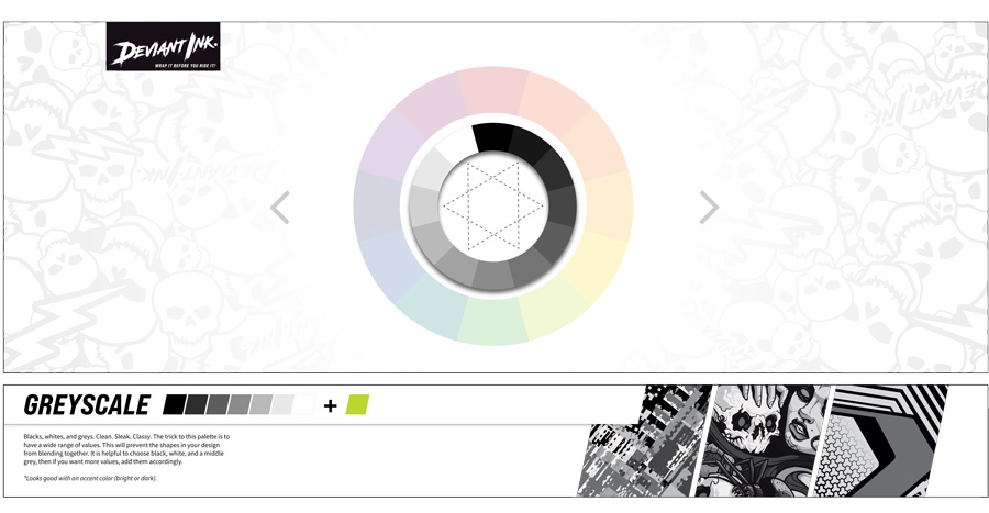
GREYSCALE COLORS
Blacks, whites, and greys. Clean. Sleak. Classy. The trick to this palette is to have a wide range of values. This will prevent the shapes in your design from blending together. It is helpful to choose black, white, and a middle grey, then if you want more values, add them accordingly.
*Looks good with an accent color (bright or dark).
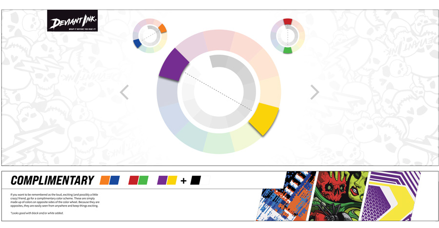
COMPLIMENTARY COLORS
If you want to be remembered as the loud, exciting (and possibly a little crazy) friend, go for a complimentary color scheme. These are simply made up of colors on opposite sides of the color wheel. Because they are opposites, they are easily seen from anywhere and keep things exciting.
*Looks good with black and/or white added.
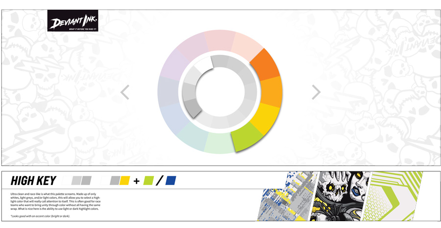
HIGH KEY COLORS
Ultra clean and race-like is what this palette screams. Made up of only whites, light greys, and/or light colors, this will allow you to select a highlight color that will really call attention to itself. This is often good for race teams who want to bring unity through color without all having the same wrap. What is nice here is the ability to use light or dark highlight colors.
*Looks good with an accent color (bright or dark).
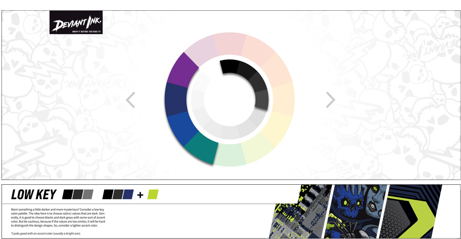
LOW KEY COLORS
Want something a little darker and more mysterious? Consider a low key color palette. The idea here is to choose colors/ values that are dark. Generally, it is good to choose blacks and dark greys with some sort of accent color. But be cautious, because if the values are too similar, it will be hard to distinguish the design shapes. So, consider a lighter accent color.
*Looks good with an accent color (usually a bright one).
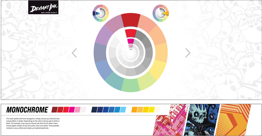
MONOCHROME COLORS
This color palette will never disappoint. Simply choose your desired color and go lighter or darker (depending on the color) until you get to white or black. For example, if you were to choose red, then for the other colors, choose lighter shades of red, then pinks, then even white. These palettes maintain a very unified and simple, yet sophisticated look.